Client Launch // Diane Schade NP
Working with Diane Schade NP was a wonderful experience! She is a warm and caring certified Geriatric and Palliative Nurse Practitioner (who bears a strong resemblance to author Elizabeth Gilbert if you ask me:).
Diane's branding was inspired by her love of the the soft and soothing shades of ocean blues and greens.
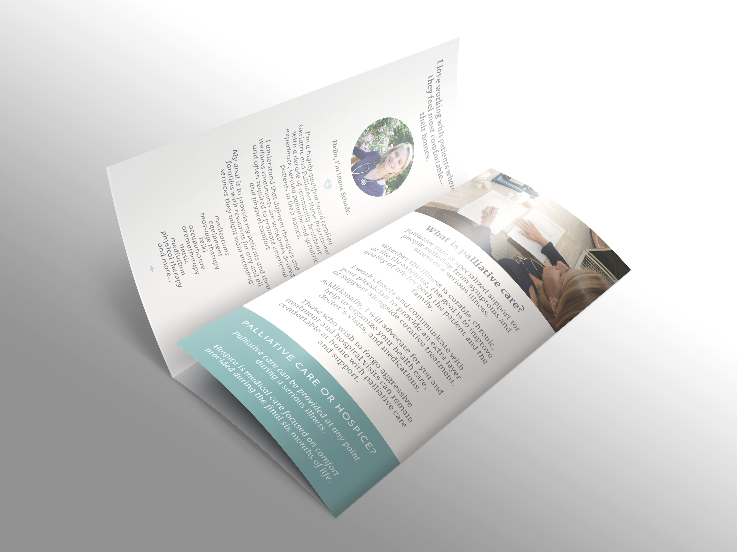
Because many of her patients are elderly, we made sure that all her materials are very simple and easy to read.
Diane is launching her new business and will be networking with organizations and physicians in her area. To make sure she leaves a lasting impression, we created a print brochure to market her services to potential patients, community organizations, and within the medical community. Her brochure echoes the message of her website so when people arrive at her site after reading her brochure, they instantly understand they are in the right place.
The design of Diane's site is clean and minimal, yet warm and inviting. Every single page was created with ease of navigation as the top priority.
Congratulations to Diane Schade NP! We wish you much success:) Thank you for being such a lovely client. We truly enjoyed working with you ❤︎


