Is Your Squarespace Website Working for You?
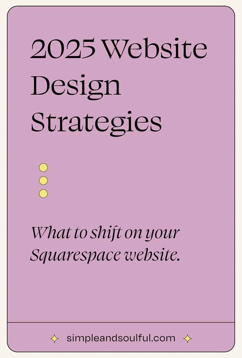
Design Strategies for 2025 That Attract, Engage, and Convert
Your website isn’t just a digital business card. It’s your first impression, your storefront, and often, your most consistent point of connection with the people you serve. Whether you're a coach, creative, or health care practitioner, your site should reflect the depth of your work and help your business grow.
In 2025, your website has to do more than look good. It needs to be clear, engaging, and functional. It should work like a team member: drawing the right people in, guiding them with ease, and helping them take that next step toward working with you.
Let’s explore how to know if your site is truly working for you, and what to shift if it’s not.
What “Working for You” Looks Like in 2025
A soulful, strategic website:
Reflects who you are and the work you do
Speaks clearly to the people you're meant to serve
Builds trust through intentional layout and messaging
Offers gentle, confident guidance toward your services or offers
It doesn't overwhelm. It invites.
Five Design Shifts That Strengthen Connection and Conversion
1. Treat Your Homepage Like an Introduction, Not a Brochure
Instead of listing everything you offer right away, focus on the big picture. What do you want your visitor to know, feel, and do within the first 10 seconds?
A great homepage introduces who you are, what you offer, who it’s for, and what transformation is possible. From there, it gently leads into deeper details.
2. Lead with the Transformation
Health care practitioners and coaches often list services or modalities. But your ideal client is searching for relief, clarity, or change.
Show them what's possible. Use language like:
“Feel calm and confident in your body again”
“Speak with clarity and ease in high-stakes moments”
“Heal from burnout and reconnect to your purpose”
That’s what they’re looking for—and what your website should reflect.
3. Simplify Your Navigation
Too many menu options confuse visitors. Choose the 3 to 5 most important destinations on your site. Prioritize clarity over cleverness.
For example:
Home
About
Work With Me / Services
Blog / Resources
Contact
A simplified structure creates calm, trust, and momentum.
4. Let Your Personality Come Through
Your tone, visuals, and voice matter. Is your current site stiff or generic? Do your photos look like you? Does your writing sound like how you speak?
You don’t have to be loud or quirky—just honest and human. The more authentic your site feels, the more it will resonate with the people you're here to help.
5. Make the Next Step Obvious
Each page should include a clear, natural invitation. That could be:
“Book a free consult”
“Browse the services”
“Get the free guide”
“Join the waitlist”
If your visitor is ready, make sure they don’t have to guess where to go next.
Signs Your Website Might Need a Refresh
You're attracting the wrong kind of inquiries—or no inquiries at all
Your business has evolved, but your site hasn’t
You feel hesitant to send people to it
It’s hard to update or not mobile-friendly
You feel like your online presence doesn’t reflect the quality of your work
You Don’t Have to Start From Scratch
A full redesign isn't always necessary. Here are some aligned next steps:
Audit your site for clarity, messaging, and flow
Refresh your copy and images to reflect your current work and personality
Consider a semi-custom solution like a Foundation Site that gives you the polish of a professional design with faster turnaround and less overwhelm
Final Thoughts
You deserve a website that reflects the depth of your work and supports your next chapter. Whether you're leading people through healing, growth, or transformation, your online presence should create a connection from the very first click.
If you're ready to align your website with your evolving brand, I'm here to help. Together, we can create something that looks good, feels like you, and works beautifully.

About The Author:
Moses Ward keeps Simple & Soulful organized and optimized behind the scenes. He’s unabashedly deep into the nerd regarding all things SEO, technology, data, and conversions — and loves empowering people with business advice that gets impressive results (and gets bonus points for being trend-proof and tacky-free). He’s got a voice for radio (so says his biz & life partner). Book a call or you’ll never know.
Tired of feeling lost in DIY-ville? I’d love to help you.
✳︎ SIGN UP FOR A 30-MINUTE CONSULTATION ✳︎?